CASE STUDY · DOCROACH · FREELANCE · 2.5 MONTHS
Hospitals run on chaos. Docroach needed one dashboard to replace it.
I had 2.5 months, 3 user types, and a dev team that scrapped my designs 3 weeks before launch.
COMPANY
Docroach — B2B Healthcare SaaS
ROLE
Product Designer (Freelance)
DURATION
2.5 months
SCOPE
Research, Flows, UI, Design System, Landing Page
3
user types researched
2-click
appointment booking goal
Shadcn
design system base (pivoted to)
CONTEXT — FAST
THE PROBLEM IN ONE LINE
"I don't want to spend more time figuring out the software than curing patients."
— doctor pain point from research
WHAT DOCROACH NEEDED
A B2B dashboard
Managing patients, billing, staff, appointments — without looking like a spreadsheet from 1999.
CHAPTER 1 — THE INVISIBLE CHAOS
Hospitals have a software problem nobody talks about.
Before opening Figma, I went and talked to the people who actually use hospital software every day — doctors, receptionists, and admins. The pain wasn't the lack of features. It was the chaos hiding inside the existing tools.
DOCTORS
Navigating, not diagnosing
Spending more time navigating software than diagnosing. Too many screens to find one patient file.
RECEPTIONISTS
12 clicks to book
Booking an appointment required 12 clicks across 3 different screens. Under pressure, every click is a mistake waiting to happen.
ADMINS
Three tabs minimum
Billing lived in one system. Patient records in another. Staff schedules in a spreadsheet. Three tabs minimum to answer one question.
CHAPTER 2 — THE SPY MISSION
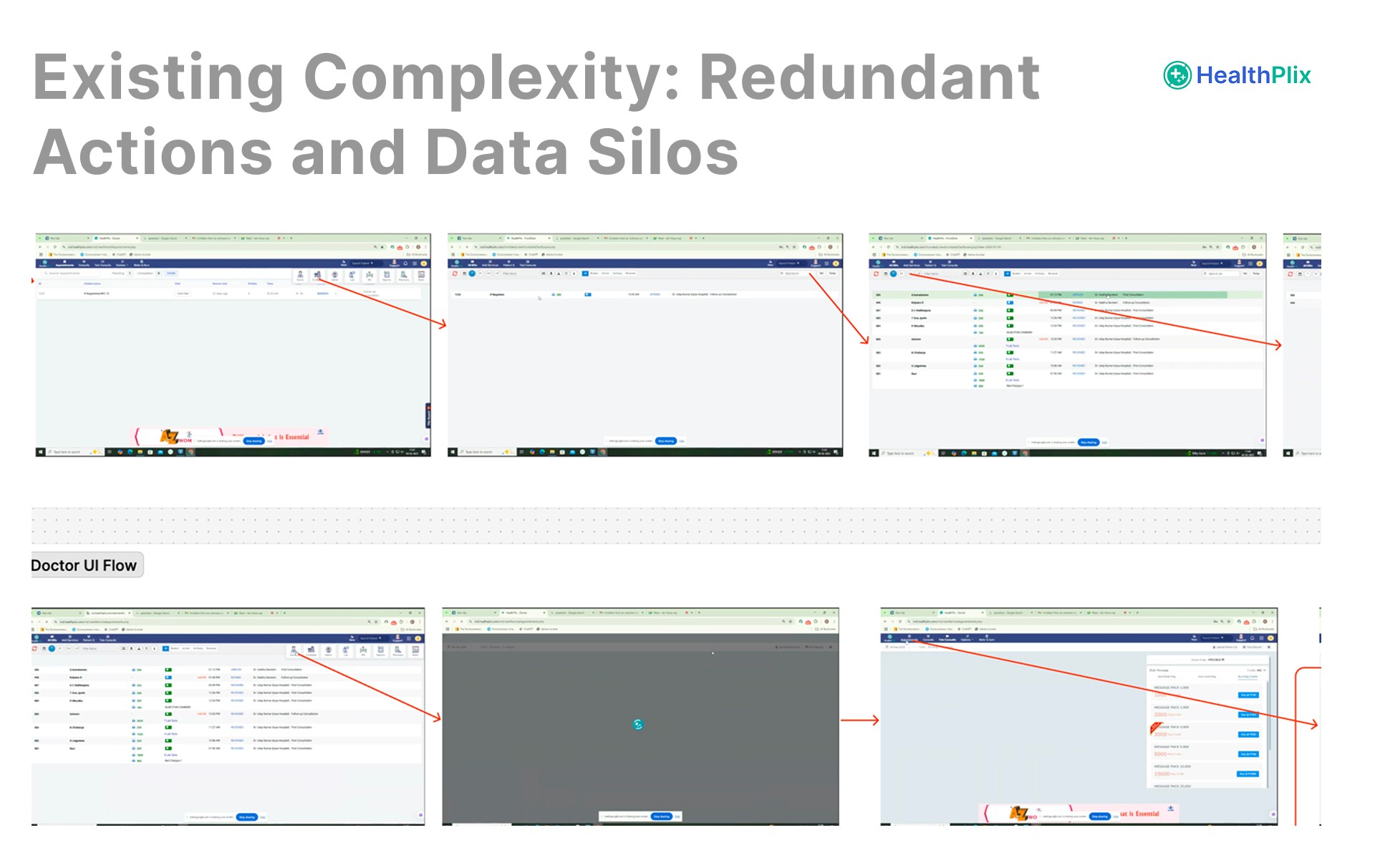
Before opening Figma, I infiltrated the competition.
I didn't want to guess the user flow — I wanted to steal the verified one and fix the bad parts. So I did a deep audit of the two biggest players in the market.
THE GIANT
Healthplix
Full EHR platform. Handles everything from Doctors to Labs.
✓ Blueprint of hospital workflow
✗ UI so old it causes delays
THE SPECIALIST
Medivision
Pharmacy specific web app. I interviewed a pharmacist using it.
✓ Inventory flow logic
✗ Poor accessibility
Healthplix UX Audit
Medivision UX Audit
THE STRATEGIC SHORTCUT
We used Healthplix's verified user journey as our base. Then stripped away every accessibility issue, every confusing step, every "why is this here?" moment. We started with a proven flow and made it 10× faster to use.
CHAPTER 3 — SURGICAL WIREFRAMING
Most designers wireframe every screen. I only wireframed the ones that could hurt users.
Since I'd already spied on the competition, I knew which flows were proven. I skipped wireframing login and settings — those are solved problems. I focused only on the two flows where mistakes cost real time in a hospital.
DOCTOR'S CRITICAL FLOW
How fast can they diagnose?
Patient in → see records → write notes → prescription out. Every extra click = slower care.
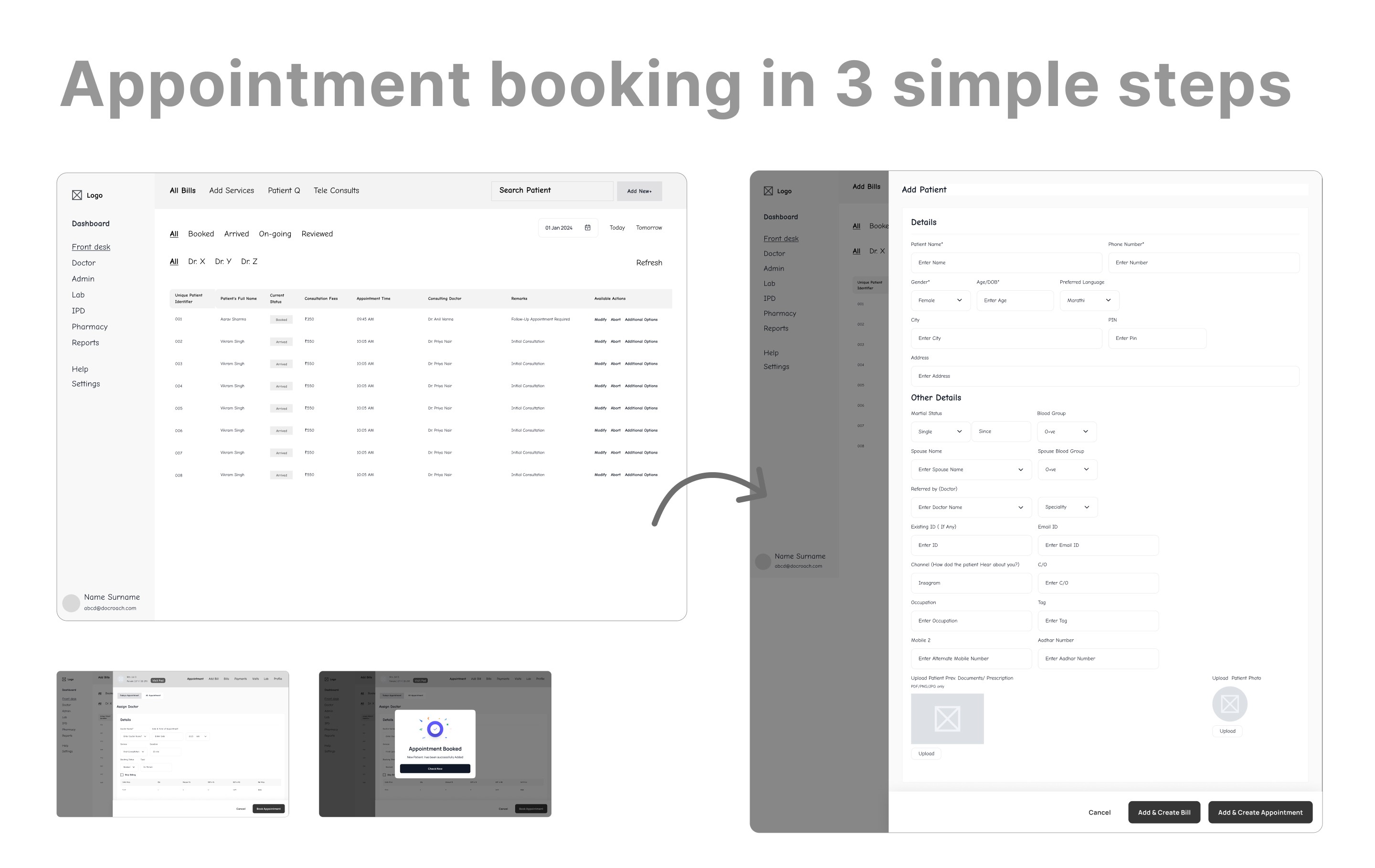
RECEPTIONIST'S CRITICAL FLOW
How fast can they book?
Patient arrives → check slot → confirm → done. Goal: 2 clicks, not 12.
CHAPTER 4 — THE PIVOT
My designs looked great. Then the dev team gave us a reality check.
"We need to build this on Shadcn UI. Now. The launch deadline is fixed."
— dev team, 3 weeks before planned handoff
I had built a beautiful custom UI. Unique buttons, custom shaped components, a layout I was proud of. The dev team said they couldn't build it in time from scratch — they needed Shadcn's pre-built components to hit the deadline.
The two options in front of me:
OPTION A — FIGHT FOR MY DESIGNS
Push back on devs
Ask for more time. Risk missing launch. Keep the pretty UI.
Result: delayed launch, frustrated team, same product.
OPTION B — ADAPT AND WIN
Install Shadcn in Figma
Map our brand identity to their tokens. Adapt instead of rebuild.
Result: on-time launch, stronger system, better handoff.
I chose the product. I scrapped the custom UI and installed the Shadcn library in Figma. Then instead of just using it as-is, I mapped our brand tokens on top — Manrope font for readability in clinical settings, our color palette as semantic variables, modified component spacing for data-dense tables doctors actually read.
BEFORE — CUSTOM UI (SCRAPPED)
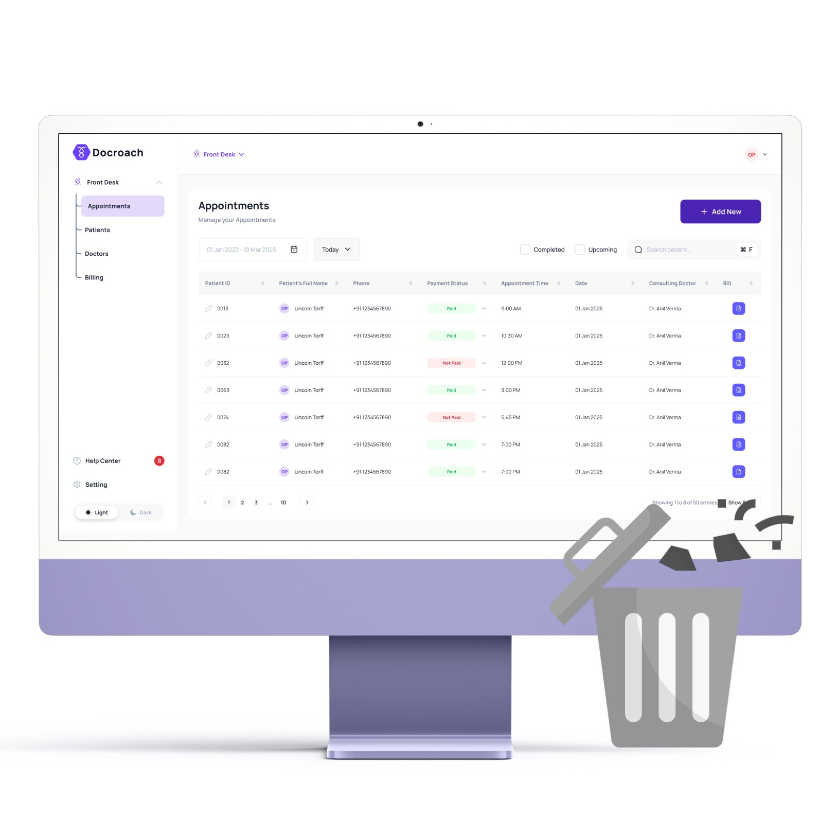
—
AFTER — SHADCN ADAPTED
—

Modified Shadcn Figma Design System
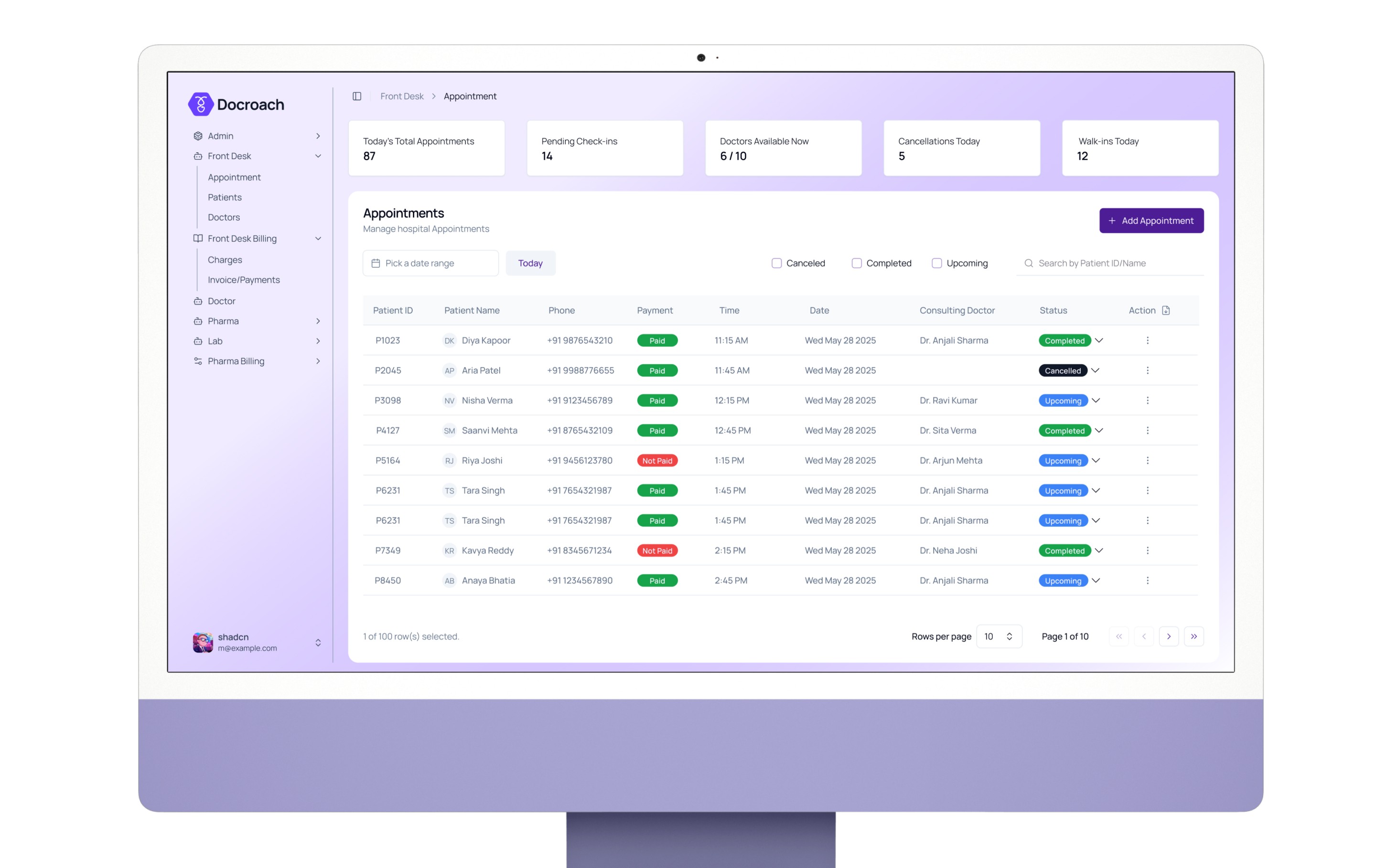
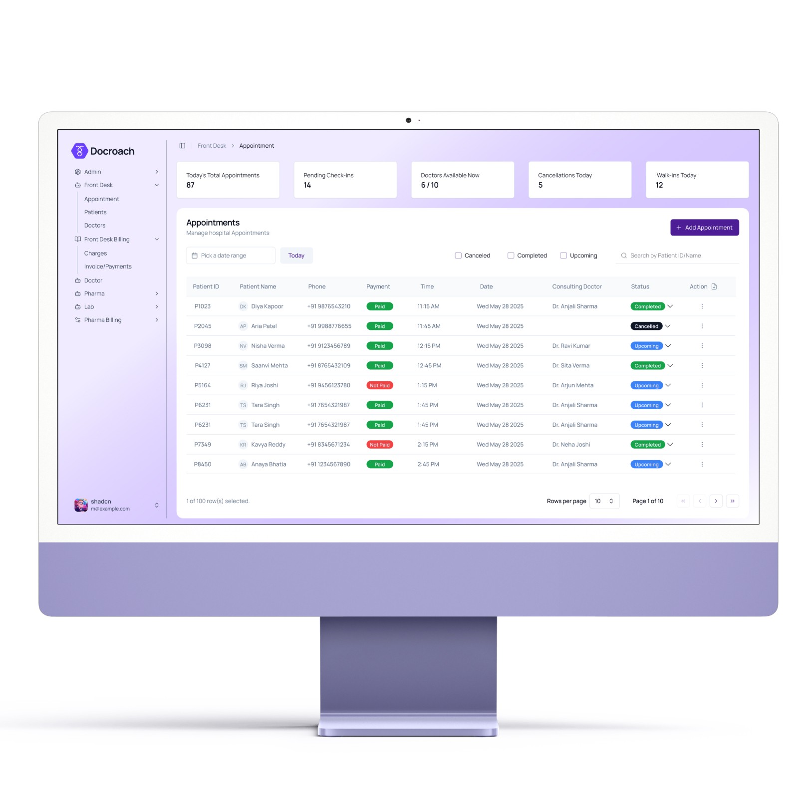
THE PRODUCT — FINAL SCREENS
UI Design based on Shadcn Design System
Every screen went through the design system before handoff. Consistent spacing, tokens for every color, annotations for every interactive state.
Modified Shadcn Figma Design System

Front Desk Appointment Booking
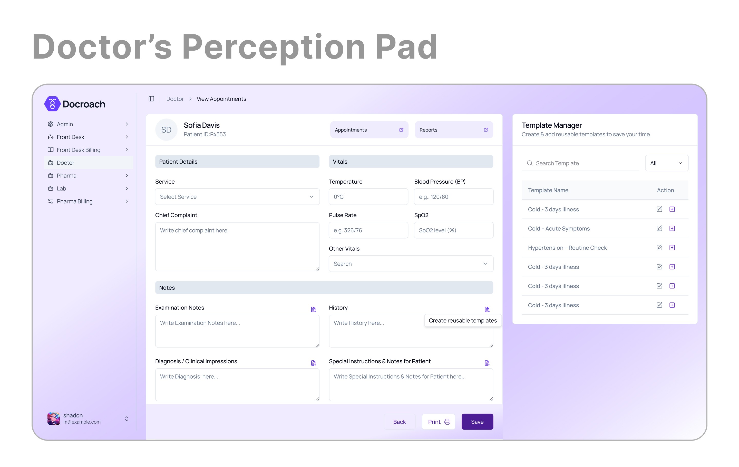
Doctor’s Perception Pad
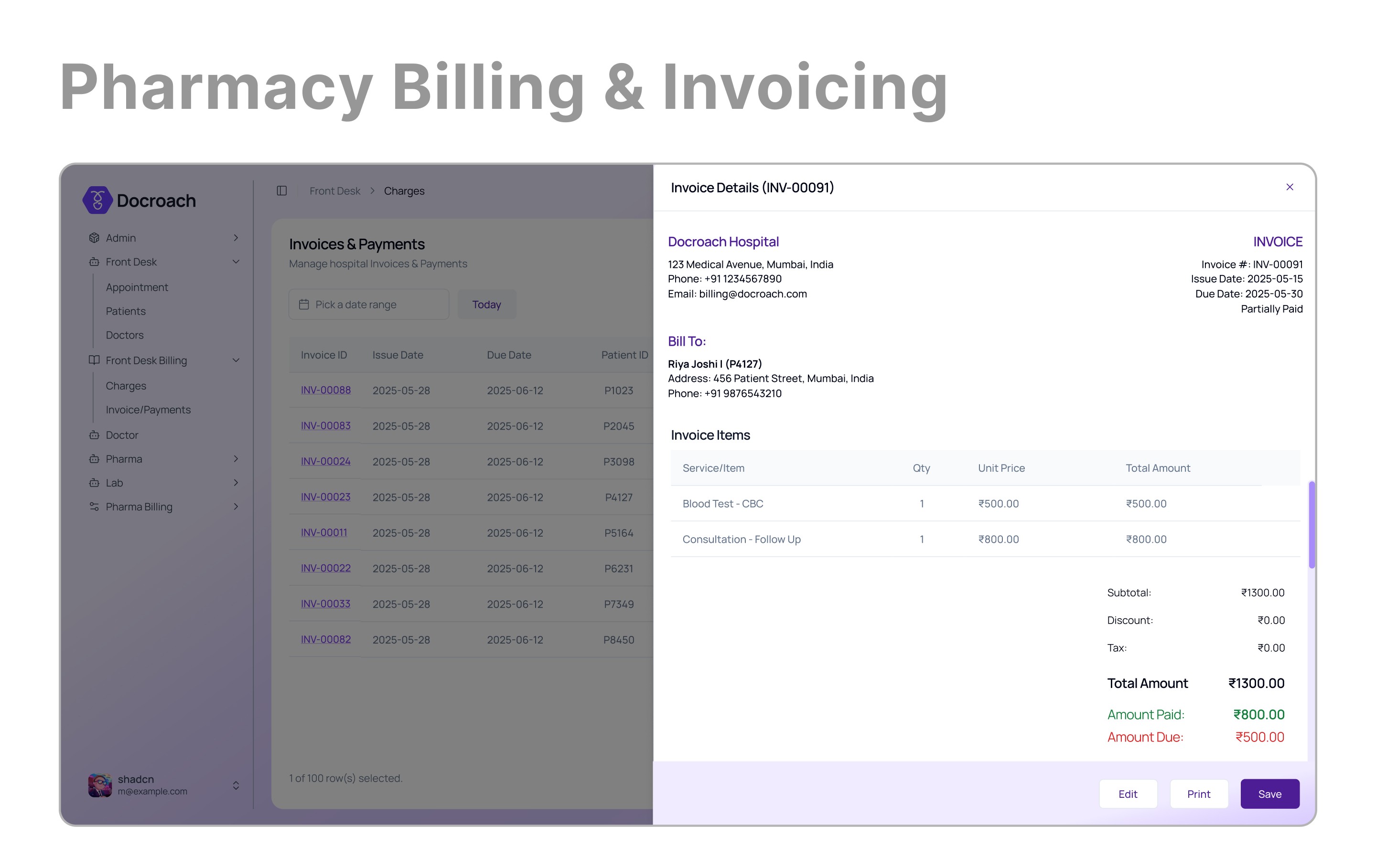
Pharmacy Billing & Invoicing
20+
High-fidelity designs covering the end-to-end patient journey.
4-Way
Integrated ecosystem for Front Desk, Doctor, Pharmacy, and Lab.
<1 mins
Average time to complete patient appointment booking*.
PROTOTYPE
Figma Prototype of Docroach
CHAPTER 6 — LANDING PAGE
To sell Docroach to hospitals, I stopped thinking like a designer and started thinking like a storyteller.
Every competitor listed 100 features. Docroach sold one feeling: relief. No more spreadsheet chaos. No more missed billing. No more guessing who's on shift. I built the landing page around that single emotion.
THE STRATEGY
One feeling: relief
Not a feature list.
THE MESSAGE
"Hospital management without the headache."
Clear, direct, emotional.
THE VISUALS
Large confident shots of the new UI
Proof it doesn't look like Excel.
PROTOTYPE
Landing Page Design
WHAT I LEARNED
Good design works within constraints — not against them.
When the dev team said "Shadcn only" — I didn't fight it. I adapted. That decision saved 3 weeks, gave us a stronger system, and made handoff faster than any custom UI would have. The product won. My ego didn't. That's the right trade.
Healthcare taught me
In high-pressure domains, slow UI is not a UX problem — it is a patient problem. Every second saved on the receptionist's booking flow is a second that goes back to care.
What I'd do differently
I'd bring devs into the design process from day one — not at handoff. The Shadcn constraint would have been known week 1, not week 7. Earlier alignment = better design.
Back
