
Docroach
From 1990s-era clinical software to a modern RBAC EHR for clinics and hospitals
Front desk
Lab results
Doctor
Pharmacy
Shipped
2024 version built by the client’s developer and released
4 roles
front desk, doctor, lab and pharmacy on one patient record
2 products
studied first, used by 14,000+ doctors and 32,000+ pharmacy owners
WCAG 2.2
low vision, colour blindness and keyboard-only use
ROLE
Product designer, solo
CLIENT
White-label EHR, sold to clinics and hospitals
TIMELINE
2024: Mar to Jun, 3 months · 2026 refresh: Sep to Oct, 1 month
WORKED WITH
Client lead, a developer, two healthcare advisors
The
problem.
{ 01 · Why clinic and hospital software needed a redesign }
CONTEXT · WHY THIS PROJECT
SEE THE PROCESS ↗
SEE THE DESIGN APPROACH ↗
PROBLEM STATEMENT
Hospital software should feel like this decade.
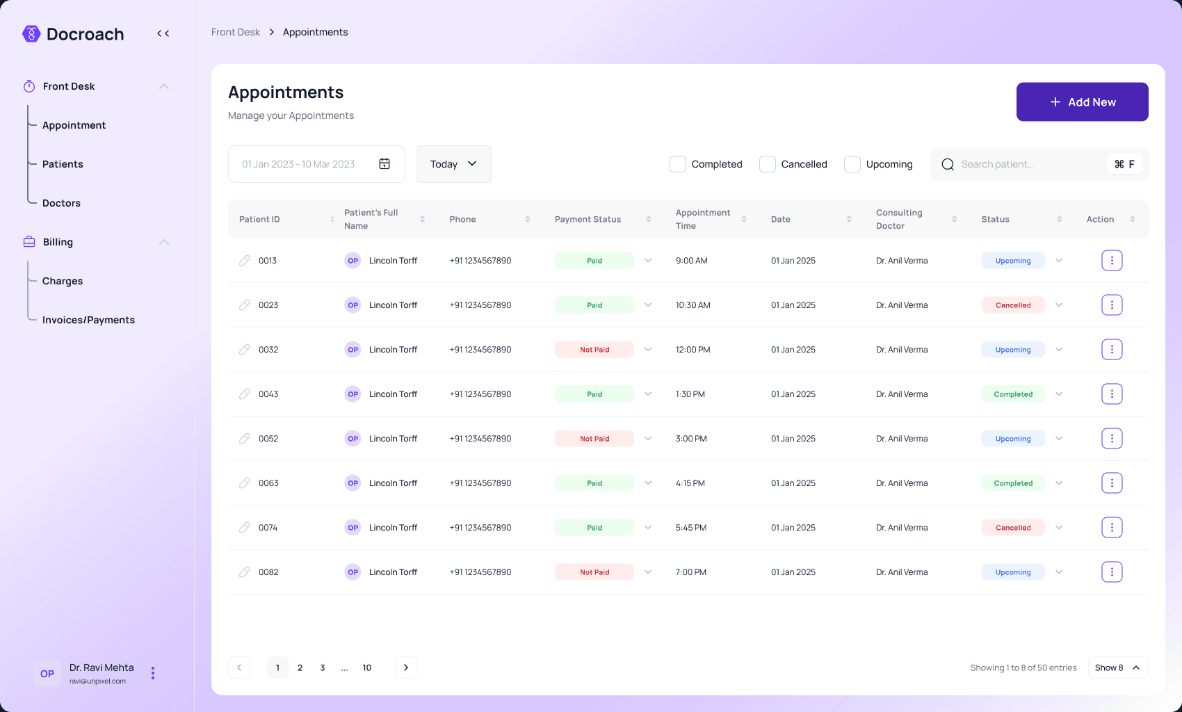
Then
Dense, dated, hard to learn
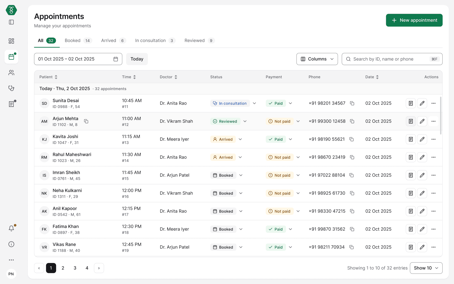
Now
Clear, familiar, quick to learn

THEN · WHAT CLINICS RUN ON · AI ILLUSTRATION

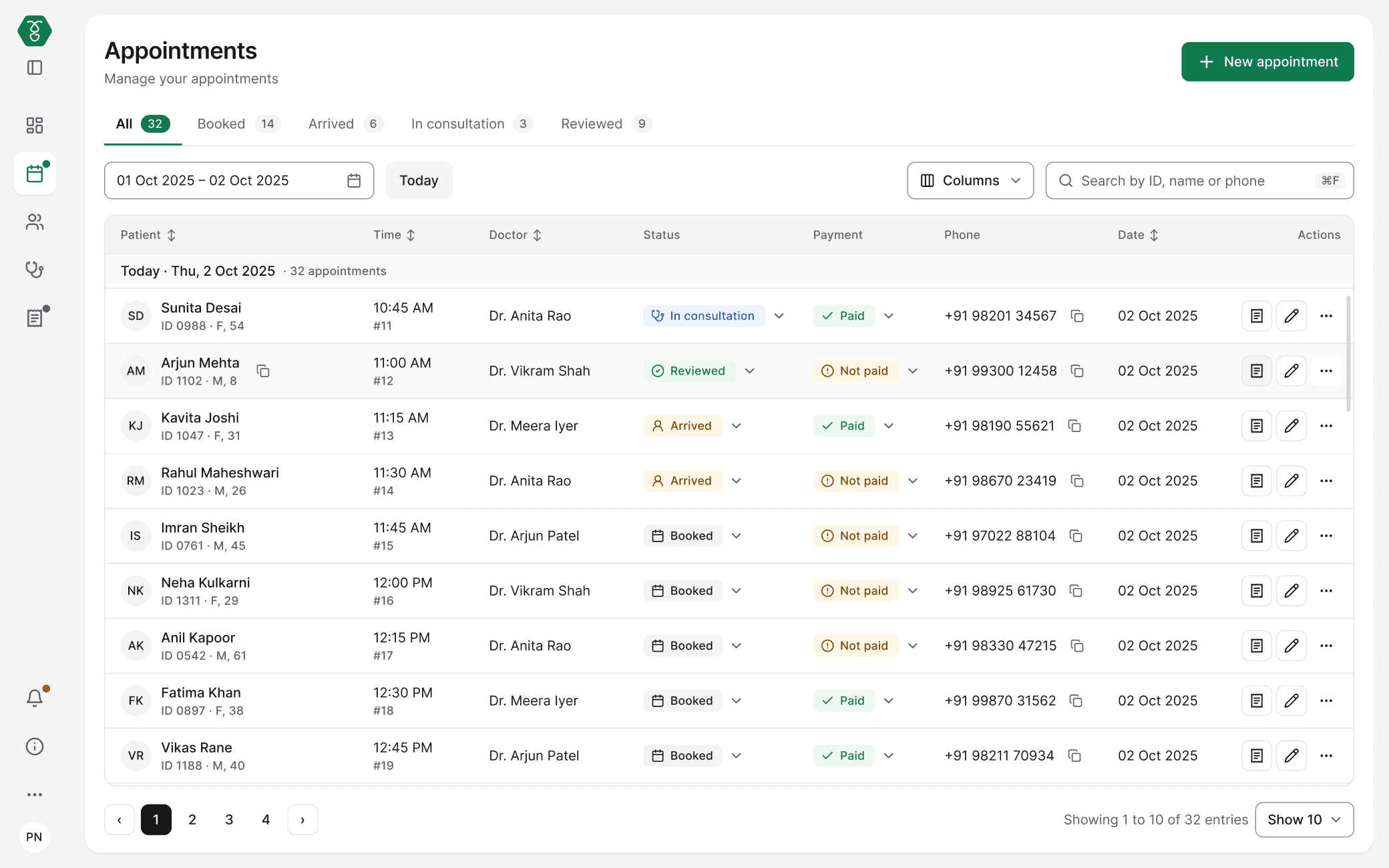
NOW · DOCROACH
The
approach.
{ 02 · Ground research, stakeholder insights, pain points, role profiles, the brief }

DISCOVER + DEFINE
SEE THE PROCESS ↗
GROUND RESEARCH
I studied the software clinics already use.
Clinic software is B2B and closed, so I asked people who use it every day to show me.
HealthPlix
CLINIC EMR
14,000+
doctors
30 million+ patients treated on it · 16 specialties
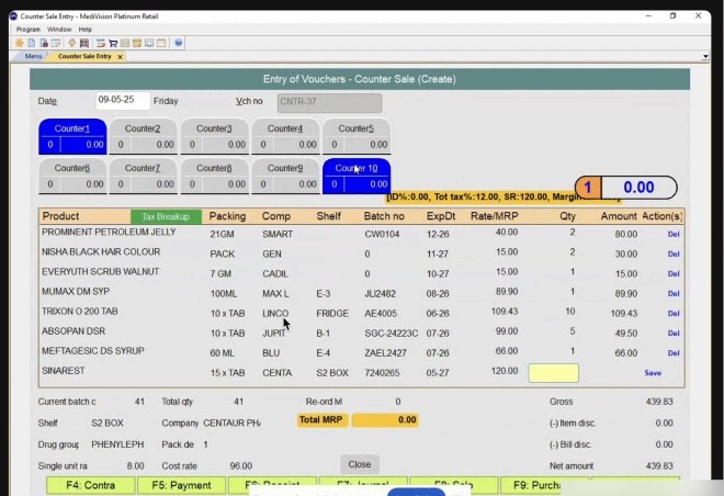
MediVision
PHARMACY RETAIL SOFTWARE
32,000+
pharmacy owners
Two decades in the market · by Allied Softech
FROM THE RECORDINGS
-
A real call, then six screens from it. Faces, names and clinic details are blurred.




MAPPED IN FIGJAM
FRONT DESK
DOCTOR
LAB
PHARMACY
→
↙
→
About 120 screenshots, laid out desk by desk.
TAKEAWAY
A solid base: which functions each desk really needs, and how they already work.
STAKEHOLDER INSIGHTS · TEAM
One designer, and four voices that changed the design.
I was the consultant designer. The team: one person on the client side and two people from the healthcare domain. Pharmacists in my network joined calls.

DEVELOPERS
Keep one table everywhere. Change only what has to change.
→ One table, one badge, one action column across all four roles.
THE STACK
It has to be buildable on shadcn.
→ Every part maps to a shadcn part. Nothing to invent.
PHARMACISTS · CALLS
Several customers arrive at once.
→ A bill can be saved and reopened; part can be given now, the rest later.
HEALTHCARE TEAMMATES
This is how a real day runs in Healthplix.
→ Its statuses and steps are kept, so the screens feel familiar.
Shubham
PARAPHRASED FROM CALLS AND REVIEWS · NOT DIRECT QUOTES
WHO FEELS IT · PAIN POINTS
Six problems I set out to fix.
My hypotheses, drawn from reviewing the 2024 version, the Healthplix walkthrough and calls with pharmacists.
STAFF NOTICE BOARD · WHAT SLOWS US DOWN
FEEDBACK SLIP
DESK
Front desk
SLOW BOOKING
Booking one patient takes too many screens while the queue waits.
FEEDBACK SLIP
DESK
Doctor
SCATTERED HISTORY
I search for the history instead of examining the patient.
FEEDBACK SLIP
DESK
Lab
LATE RESULTS
Reports go out on paper. The doctor and the patient both wait.
FEEDBACK SLIP
DESK
Pharmacy
UNCLEAR PRESCRIPTIONS
I can’t read the prescription, so I call the doctor back.
FEEDBACK SLIP
DESK
Every desk
NO SHARED RECORD
The same patient details are typed again at every desk.
FEEDBACK SLIP
DESK
Every desk
HARD TO READ
Faint text and tiny buttons. Hard on the eyes all day.
ILLUSTRATION · PROBLEMS WRITTEN BY ME AS HYPOTHESES, NOT STAFF QUOTES
USER ROLES · DESIGN PERSONAS
Four desks, four states of mind.
Same patient, very different pressure at each desk.
Role profiles built from the Healthplix walkthrough, pharmacist calls and the 2024 app. They are not interviewed users. Photos are AI-generated illustrations.

STATE · MULTITASKING
Front desk
Book fast, without mistakes.
Slow booking
No shared record

STATE · PRECISE
Lab technician
Right report, right patient.
Late results
No shared record

STATE · TIME-BOXED
Doctor
See everything, type little.
Scattered history
Late results

STATE · CAUTIOUS
Pharmacist
Clear Rx, quick billing.
Unclear prescriptions
No shared record
DEFINE · THE BRIEF
The brief I designed against.
What the research narrowed down to, before any screen was drawn.
IN SCOPE
Front desk
Doctor
Lab
Pharmacy
One shared patient record
Desktop web, 1440
WHAT GOOD LOOKS LIKE
Quick to learn
Useful for the real job
Familiar to trained staff
Buildable on shadcn
NOT IN SCOPE
Tablet and phone
Dark theme

The
solution.
{ 03 · Four roles, one patient record, 43 screens }

DEVELOP + DELIVER
SEE THE PROCESS ↗
ROLE-BASED ACCESS CONTROL (RBAC)
One product. Access decided by role, not by person.
Role-based access control: each role signs in to its own pages and actions. Only the patient record is shared.
ROLE → PAGES IT CAN ACCESS
FRONT DESK
Dashboard
Appointments
Patients
Doctors
Billing
DOCTOR
Dashboard
Appointments
Patients
Calendar
Templates
LAB
Dashboard
Tests
Find reports
Services
PHARMACY
Dashboard
Billing
All bills
Payments
SHARED BY EVERY ROLE: NOTIFICATIONS · HELP CENTRE · SETTINGS · PROFILE
ONE PATIENT RECORD · WHAT EACH ROLE ADDS AND PASSES ON
01 · FRONT DESK
Finds Rahul. Books 11:30. Takes ₹820. Checks him in.
→ complaint, token #14, tests to bill
→
02 · DOCTOR
Sees allergy first. Orders 2 tests. Writes 2 medicines.
→ prescription to pharmacy, tests to lab
→
03 · LAB
Takes ₹200 due. Collects sample. Approves results.
→ report to doctor, flagged values first
→
04 · PHARMACY
Opens the same prescription. Swaps a brand. Dispenses.
→ stock updated, doctor sees the brand
USER FLOWS
User flows, mapped from the software I studied.
A short overview of each role’s journey. The steps come from the HealthPlix and MediVision walkthroughs; the branches are where Docroach handles what can go wrong.
FRONT DESK · BOOK AN APPOINTMENT
Search patient
FD-1
→
Found?
FD-6 if not
yes →
Pick doctor and slot
FD-3b
→
Slot taken?
FD-2d if yes
no →
Take payment
FD-3b
→
Check in
FD-1
→
✓ Booked, token given
FD-2e
Register, or scan ABHA card
no
FD-2 · FD-2f · FD-2g · duplicate phone check FD-2c
Next free slot is offered
yes
never picked silently
Step
Decision
Branch
DOCTOR · LAB · PHARMACY
DOCTOR
Open next patient
→
Allergy and complaint shown
→
Vitals and notes
→
Order tests
→
Add medicine
→
Allergy conflict?
→
Preview
→
Send
LAB
Open bill
→
Payment due?
→
Collect sample
→
Enter results
→
Value possible?
→
Approve
→
Report to doctor
PHARMACY
Open prescription
→
In stock?
→
Find alternative or give later
→
Take payment
→
Payment failed?
→
Receipt
→
Dispense
Visual
design.
{ 03a · The screens, desk by desk: front desk, doctor, lab, pharmacy }
Role 01 · Front desk
Desktop 1440
Book a patient with the queue still in view.
Solves
Slow booking
No shared record
User's state (assumed, from calls)
Multitasking: phone in one hand, a queue at the desk.
Design response
Booking opens in a side drawer over today's queue, prefilled for returning patients.
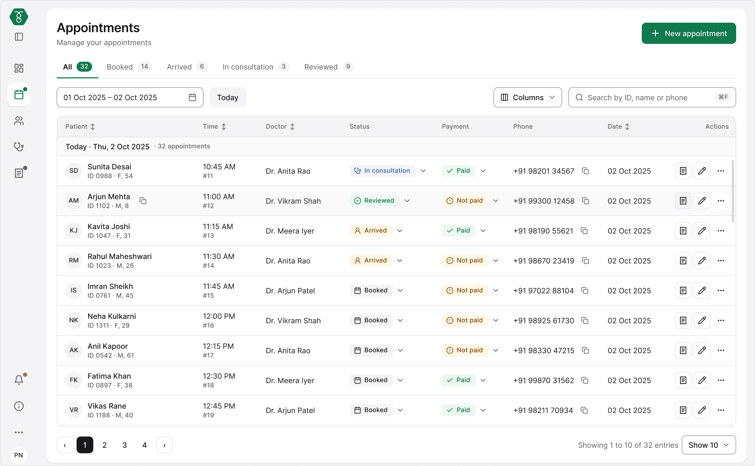
1
Today first
Queue sorted by time, sits top-left.
Most-used first
Scannable table
2
One primary action
"New appointment" is the only filled button.
One primary button
Hick’s law
3
Patient ID first
One search finds a patient by ID, name or phone.
One search
Recognition over recall
4
Status, not colour
Booked / Arrived / In consultation / Reviewed = icon + label.
Icon + label
Never colour alone
Four states of the same booking
✓ Happy

Queue stays visible; slots as chips, not a dropdown.
✕ Error

If the slot was just taken, the next free one is suggested, never picked silently.
◆ Edge

Phone number already on file? Check the match before creating a second record.
★ Good end

Token, time and doctor confirmed in a toast, with Undo instead of a confirm dialog.
Accessibility
Focus stays inside drawer
Targets ≥ 24px (40px primary)
FRONT DESK · REAL DATA
Built for real data, not demo data.
Three-digit counts, long names and ten columns. The sidebar collapses to a rail, columns can be hidden, and the table scrolls with the patient and actions pinned.

Sidebar open · Columns menu
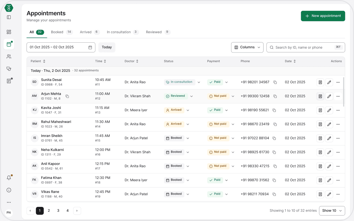
Sidebar collapsed · full table

No match · a clear way out
Role 02 · Doctor
Desktop 1440
See the whole patient on one screen. Type as little as possible.
Solves
Scattered history
Unclear prescriptions
User's state (assumed, from calls)
Time-boxed: a few minutes per patient, with a queue outside the door.
Design response
One consult pad shaped like the printed prescription. The allergy stays pinned at the top.

1
Allergy pinned
Shown in the patient bar before any medicine is picked. Never typed mid-form.
Error prevention
2
Chips, not dropdowns
Dose and frequency are one tap each, instead of a dropdown for each.
Hick’s law
3
Shaped like the printout
The pad reads top to bottom like the paper the patient takes home.
Recognition over recall
4
Autosaved draft
An unsent prescription is kept, and resumed in one click.
Forgiving by default
Two states that matter most
! Critical

Severe allergy: the only alert that interrupts, and it offers safer options.
◆ Edge

Unsent prescription: saved as a draft, one click to resume.
• LAB AND PHARMACY, IN SHORT
Same patient, next two desks.

STEP 03 · LAB
Right sample, checked values, report straight to the doctor.
Sample time before results
High / Low flags
Approve, then send
Key decision: approving a report asks for confirmation with flagged values listed first, because it cannot be undone.
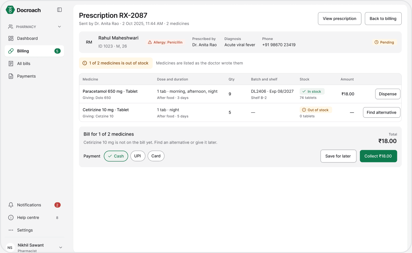
STEP 04 · PHARMACY
The same prescription in, an accurate bill out.
Totals calculated
Same-salt substitutes
Failed payment handled
Key decision: out of stock offers same-salt alternatives or “ask the doctor”, replacing the shipped “Restock” dead end.
EDGE CASES AND ERROR HANDLING
The bad day is designed too.
Front desk and doctor states are shown above. These are four more, from the lab and the pharmacy. Each says what happened and what to do next.

ERROR · LAB
Impossible value: caught while typing, with a likely fix.

IRREVERSIBLE · LAB
Approving a report: confirm, with flagged values listed first.
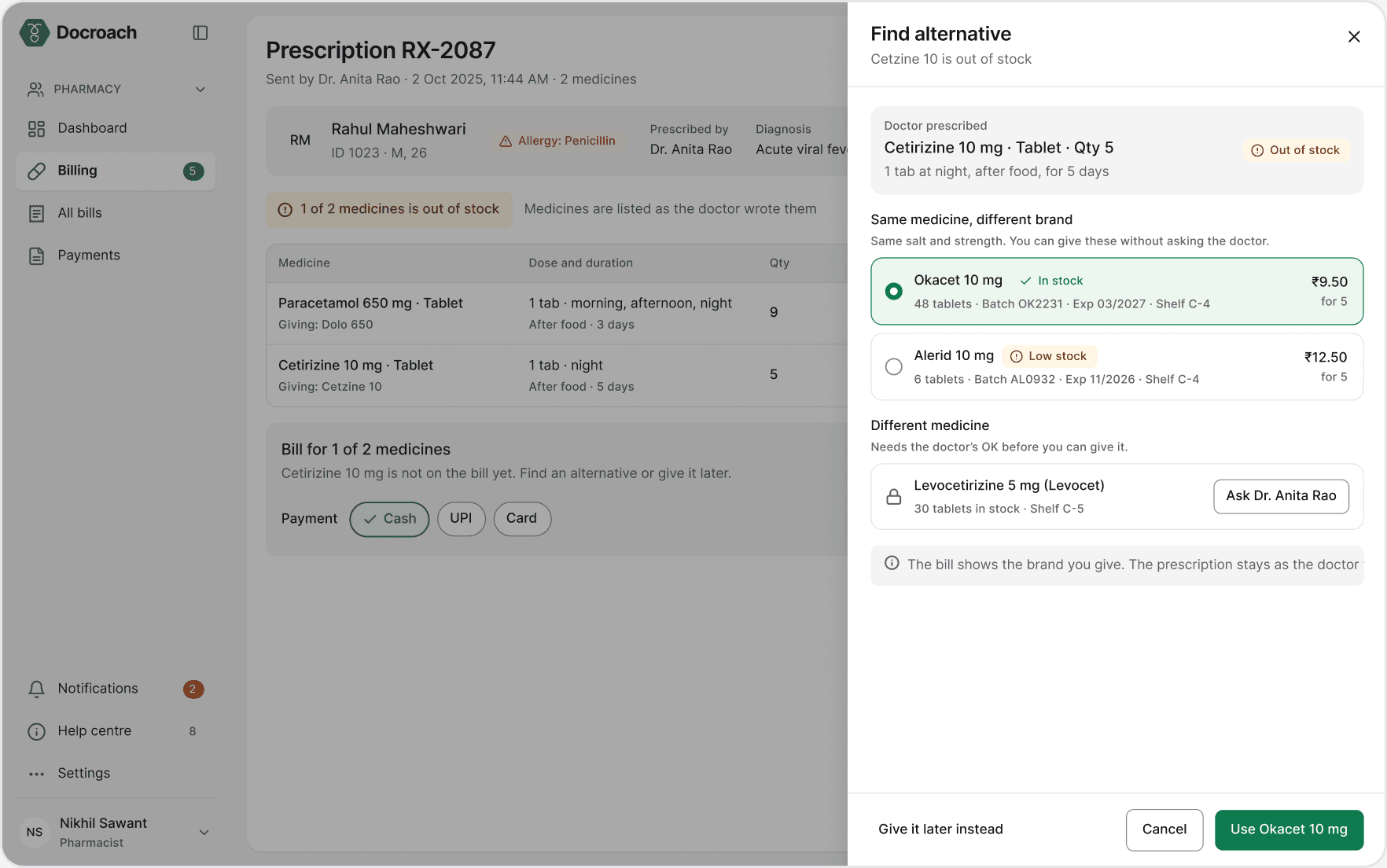
EDGE · PHARMACY
Out of stock: same-salt alternatives, or ask the doctor.

ERROR · PHARMACY
Payment failed: says no money was taken and what to try.
DESIGNING FOR A RECENT UPDATE · ABHA
Register with ABHA. The form fills itself.
India’s health ID (ABHA) now lets a clinic register a patient from a QR scan instead of typing. I designed Docroach’s front desk for it, with a review step before anything is saved.
ABHA-based “Scan and Register” runs in 30,800 healthcare facilities and has passed 25 crore OPD registrations (National Health Authority, Aug 2026).

Scan: the patient’s ABHA QR is read at the desk.
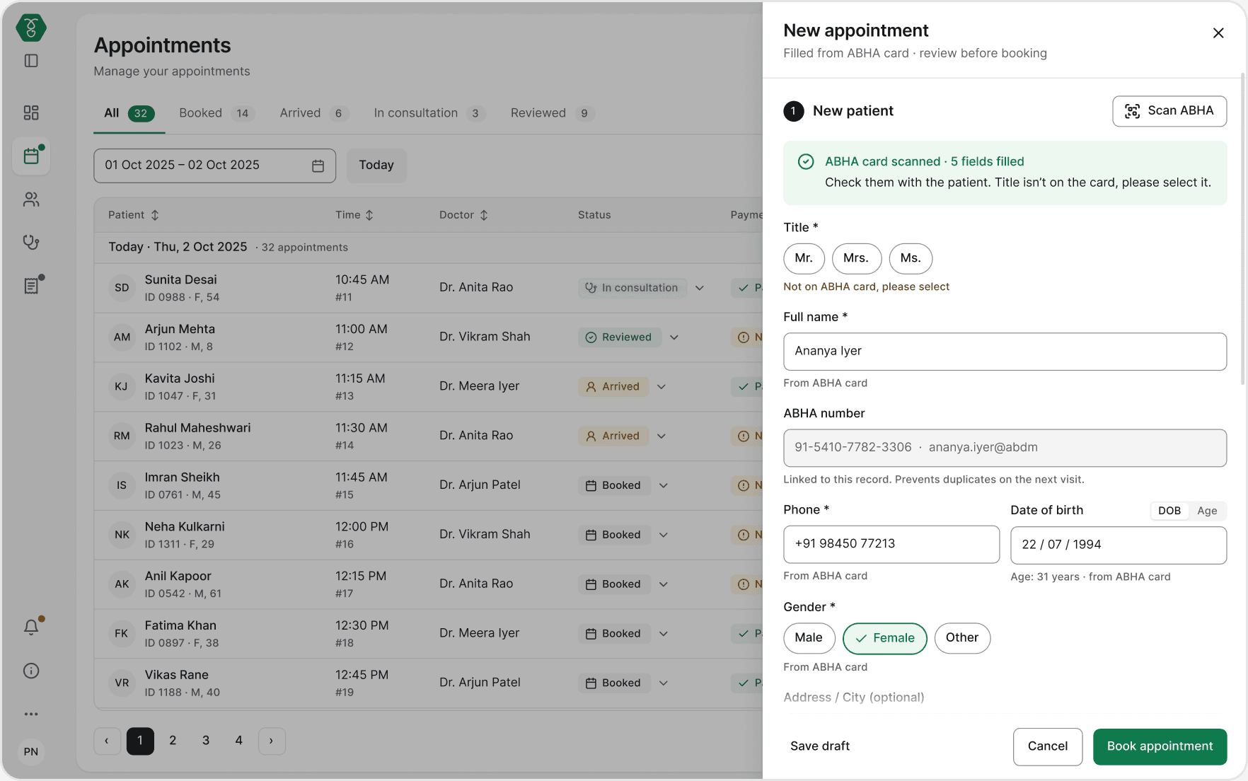
Review: fields filled from the card are marked, and stay editable.
Inclusive
design.
{ 03b · WCAG 2.2 · low vision · colour blindness · one-handed use }
Tab
INCLUSIVE DESIGN · WCAG 2.2
Designed for the people who really work these desks.
Three groups are in scope. This section takes them one by one: the problem, what they see, and what the design does.
IN SCOPE · THE SCREEN HAS TO CHANGE
LOW VISION
Works at 200% zoom, so only a quarter of the screen fits.
COLOUR BLINDNESS
Cannot rely on red and green to tell badges apart.
ONE HAND FREE
The other hand is busy, so everything runs from the keyboard.
ALREADY COVERED
LAB · PHARMACY
Hard of hearing: no alert uses sound.
NOT IN THIS ROUND
SCREEN READERS
Full screen-reader support is not designed yet.
LAB
Colour-read test strips: software cannot fix this.

WHAT I READ FIRST
w3.org › WAI › WCAG22
w3.org › WAI › people-use-web
accessibility.blog.gov.uk
webaim.org › projects
service-manual.nhs.uk

LEFT: NORMAL VISION · RIGHT: WHAT MEENA SEES
01 OF 03
Low vision
Small text is a blur, so she works at 200% zoom and only a quarter of the screen fits.
THE DESIGN
LAYOUT REFLOWS AT 200%
MEENA · RECEPTIONIST · DESIGN PERSONA
▸
Read more about Meena and the WCAG rules

Appointments at 200% zoom

New appointment at 200% zoom
Critical
Done
Critical
Done
NORMAL
RED-GREEN COLOUR BLIND
02 OF 03
Colour blindness
Red and green look alike, so a badge cannot rely on colour.
THE DESIGN
EVERY STATUS = ICON + WORD
ABOUT 1 IN 12 MEN · ANYONE READING THE QUEUE
▸
Read more about what this covers, and what it does not
NORMAL VISION

RED-GREEN COLOUR BLIND (SIMULATED)

COLOUR-BLIND SAFE MODE · NORMAL VISION
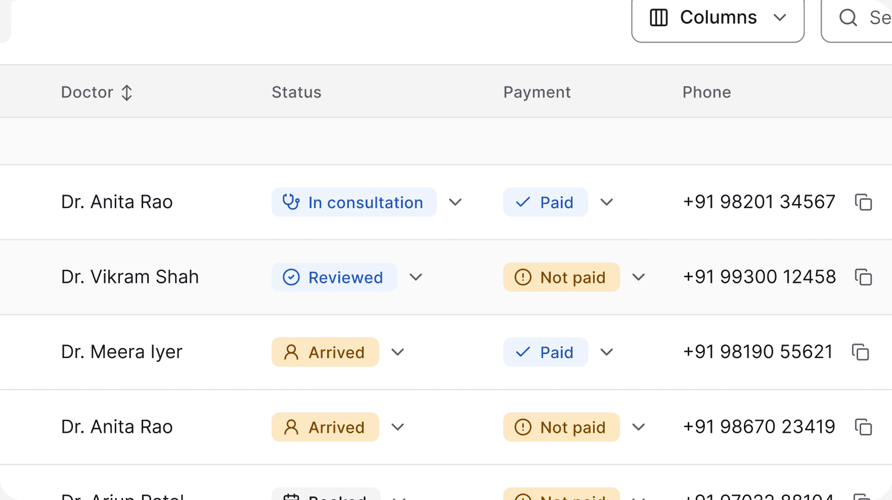
SAME MODE · THROUGH THE COLOUR-BLIND FILTER

ONE HAND ON THE KEYS · MOUSE UNTOUCHED
03 OF 03
One hand free
One hand holds the medicine, so the mouse is out of reach.
THE DESIGN
THE WHOLE BILL BY KEYBOARD
NIKHIL · PHARMACIST · DESIGN PERSONA
▸
Read more about Nikhil and the seven stops
ONE HAND, FOUR KEYS
Tab
next field
Shift + Tab
go back
Enter
do it
Esc
close
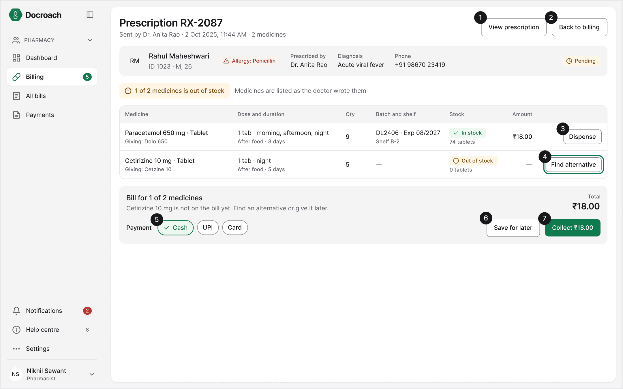
THE SWITCH
One place to turn it on.
A small Display and accessibility panel in the profile menu. Four settings, saved to the person, not the computer.
BUILT IN
NOT A THIRD-PARTY OVERLAY

▸
Covered by default, and one gap still open
▸
How it was checked: colour-blind filter, 200% zoom, keyboard only
PHOTOS ARE ILLUSTRATIVE AND AI-GENERATED · DESIGN PERSONAS, NOT REAL STAFF
Made for
scale.
{ 03c · Design system · four roles, two colour modes, one set of parts }
DESIGN SYSTEM
The design system is the backbone.
Role-based access, inclusive design and white-labelling all run on one set of tokens and parts, named after shadcn/ui so handoff is direct.
Docroach design system
81
variables
10
text styles
87
component variants
34
icons
Front desk
Doctor
Lab
Pharmacy
↓
Arrived
Paid
+ New
ROLE-BASED ACCESS
Four roles, one set of parts.
The same table, badge and button serve every desk. A role changes what is shown, not how it is built.
Paid
→
Paid
Critical
→
Critical
default mode → colour-blind safe mode
INCLUSIVE DESIGN
Change the token, not the screen.
A colour-blind safe mode swaps status colours in one place. Icon and word stay, so no screen is redrawn. Proposed, not yet built.
+ New appointment
+ New appointment
+ New
brand/primary · one token
WHITE-LABELLING
One brand colour, every screen follows.
Brand lives in one colour ramp. The client can sell Docroach under another clinic’s brand by swapping it.
SNAPSHOT · COMPONENT LIBRARY · EACH PART NAMED AFTER SHADCN
New booking
New booking
New booking
Button
shadcn · Button
Phone number
98201 34567
Used to find returning patients
Input
shadcn · Input
Medicine
Search by name or salt
Combobox
shadcn · Popover + Command
1-0-1
1-0-1
Chip
shadcn · Toggle
Waiting
Done
Critical
Draft
New result
Status badge
shadcn · Badge
Report pending
CBC sample collected 10:05 · expected by 12:30.
Alert
shadcn · Alert
Booked · Token #14
Dr. Anita Rao · 11:30 AM
Undo
Toast
shadcn · Sonner
Void invoice #INV-2041?
₹ 840 for Rahul Maheshwari will be cancelled and stock returned. This can't be undone.
Cancel
Void invoice
Dialog
shadcn · Alert Dialog
RM
Rahul Maheshwari
ID 1023 · M, 26
11:30 AM
#14
Dr. Anita Rao
Arrived
Not paid
Appointment row
shadcn · Table
The
outcome.
{ 04 · What changed from 2024 to 2026, and what I learned }
AFTER DELIVERY · WHAT CHANGED
SEE THE PROCESS ↗
OUTCOME
2024 → 2026: what changed, and why.
The project ended at handoff, so I have no usage numbers. What I can show is each change, why I made it, and how I would test it.
Dropdowns
→ chips
per medicine on the prescription
1 option
→ 3
when a medicine is out of stock
Checkbox
→ icon + label
how a patient’s status is shown
43 screens
with happy, edge and error states
COUNTED FROM THE 2024 AND 2026 DESIGN FILES · NOT USAGE DATA
SHIPPED 2024

REFRESHED 2026

01 · DOCTOR
Prescribing: typed, then tapped.
The shipped pad used dropdowns for every dose field and the allergy typed mid-form. Now dose and frequency are chips, and the allergy is pinned before any medicine is picked.
How I’d test: time to write a two-medicine prescription, and how often an allergy alert is overridden.
SHIPPED 2024

REFRESHED 2026

02 · PHARMACY
Out of stock: a dead end, then a way out.
The shipped screen offered only “Restock”. Now the pharmacist can pick a same-salt alternative, ask the doctor, or give the rest later.
How I’d test: how many bills are completed when an item is out of stock.
FROM TWO EARLIER PROJECTS · FIELD RESEARCH IN HEALTHCARE
I didn’t start with screens. I started in hospital corridors.
Two earlier projects put me on a hospital ward, in a diagnostics lab and across the table from doctors. The photos, quotes and numbers below are from those projects, not from Docroach. What I saw there shaped this product.


FEB 2024 · ETHNOGRAPHIC STUDY
15 days on a ward at Manipal Hospital, Goa.
→ Observed nurses and doctors; informal interviews and a survey.
2024 · WELLNEST
Visits to a hospital and a diagnostics lab in Pune.
→ Interviews with a surgeon and a lab manager; patient survey. 2nd prize, HackMITWPU Ideation 2024.
2024 → 2026 · DOCROACH
Clinic software for four roles, shipped and then refreshed.
→ The same lessons, applied to a real product.
DR
SURGEON · INTERVIEW
Patient history is crucial before a planned surgery. Often it is simply missing.
LM
LAB MANAGER · INTERVIEW
We ask for the patient’s history. It makes the report more accurate.
%
SURVEY · PATIENTS
47.5% struggle to gather their past prescriptions. 45.5% keep them on paper.
AWARD · 2ND PRIZE, HACKMITWPU IDEATION 2024 (WELLNEST)
READ · BEYOND THE WHITE COATS (MEDIUM) →
READ · THE FIELD RESEARCH BEHIND WELLNEST (MEDIUM) →
CONCLUSION · WHAT I LEARNED
Hospital staff are already trained on their tools. I kept what they know and fixed what slows them down.
I learned this by studying Healthplix and Medivision screen by screen, and by talking to the people who use them. Next, I would test the prototype with five clinic staff.

Shubham Mestry
Product designer
Watch the real software
Seeing how a tool is used every day tells you more than any brief.
Keep what they know
Every new pattern costs a hospital training time. Change only with a reason.
Domain first, tools second
AI can build fast. Knowing what belongs on the screen is still the designer’s job.
Other case studies
Back